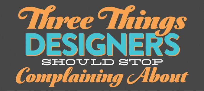
If you're a designer or work in any type of creative marketing field, you've surely come across the dozens (hundreds?) of articles, blog posts, and social media memes that have titles like, "things that drive designers crazy".
Some people take the time to develop elaborate illustrated infographics and stories, and of course there's everyone's favorite website, Clients From Hell. Certainly, many of these are entertaining at least, hilarious at best, and at some level they highlight many of the difficult, frustrating, or downright crazy stories creative professionals deal with.
However, a common element in many of these complaints is that they aren't so much a symptom of a bad client as they are a missed opportunity for the designer to offer great customer service. Here's 3 common complaints designers often have, and ways to think about them differently.
Common Complaint #1
Make the Logo Bigger!
This is such a common complaint, there's even a song about it (and in all fairness, this video is great).
I'll admit that the first few times I heard this from a client, it made me cringe. It's such a stereotypical comment, it might be hard to hear without thinking they're an idiot. You've worked hard on the design, and now they're going to ruin it by making you increase the logo so much that Google Earth will see it from space.
The Client's Perspective
Let's assume the logo was professionally designed - maybe even by you. The client is probably (hopefully) very proud of it, and understandably don't want it missed. They're competing in the marketplace and working hard to earn customers of their own, and they want to make sure their brand isn't overlooked. More than that, they probably dropped a sizable chunk of change for it, and in order to get some ROI they want to make sure its being put to good use.
Instead of Complaining, Remember...
Your client probably didn't go to art or design school. If they're giving you feedback to increase the logo size, what they likely want is for the logo to be emphasized and more prominent. A non-designers natural instinct to emphasize something is usually to make it bigger.
Of course, being a trained professional and understanding things like the Gestalt Principles, you understand how to add emphasis to an element without increasing its size.
If your client still insists that the logo be bigger, you can also try to professionally explain that often times a smaller, understated logo can actually make the brand seem more sophisticated. Try showing them examples of how other brands don't make the logo's huge to illustrate your point.
Of course, there are obvious examples of brands that do just the opposite, like McDonald's plastering huge golden arches everywhere. However, that might actually make for a great analogy of why they want to avoid having a huge logo - do they want to be the cheap fast food version of their industry?
Common Complaint #2
Clients Who Use Vague Instructions Like "make it pop" and "jazz it up"
This one is a close relative of "make the logo bigger". The client isn't quite sure how to articulate in "design terms" what it is they don't like, so they're doing their best to communicate with you.
The Client's Perspective
When you take your car to the shop with a problem, we often force the mechanic to sit there and listen while we pantomime the various thunks, groans, whirs, and booms coming from the engine. We do this because we lack the expertise to explain it properly, so we do our best to communicate with the professional who's experience will allow them to discern our incoherent ramblings into a diagnosis of the problem.
This is exactly what the client is trying to do. There's something that they feel isn't quite right, and they're simply trying to tell you with terms that are familiar to them.
Instead of Complaining, Remember...
It's your job to read between the lines of what they're saying. Here's one example of how you can take what the client says and interpret it in a more useful way.
- Client: "Make the headline pop more"
- Alternate Interpretation: "Less emphasis on other elements and more emphasis on the headline, so that the main message is totally clear and isn't missed"
Involve your client in this exercise - its totally appropriate to explain what you're doing, and in fact will most likely demonstrate that you have a great connection with them. Try saying, "I hear you, and what I think you mean is..." More often than not, I find that clients will respond with, "yes, exactly!" Not only does this help reassure them that their feedback is valid, but more importantly helps build a great designer/client relationship.
Common Complaint #3
Client's Don't Understand that White Space Gives the Design "Room to Breathe"
I read a post recently lamenting that, "client's have to understand that white space allows the design room to breathe". Often, client's ask us to add more to a design that we feel is perfectly laid out. Get another photo in there. Add more to that paragraph. Fill the space.
The Client's Perspective
Your client is likely a business person. Unless their industry is in a creative field, the phrase "room to breathe" will probably make you sound artsy-fartsy (the technical term for it), and it isn't something they're likely to understand or think is very credible advice. They're making a significant investment in hiring you, so its understandable how they might feel that filling the space as much as possible ensures they're getting the most for their money.
Instead of Complaining, Remember...
Its not required that you understand how the mechanic fixes your car. In that situation you're the customer, so its up to the other person to help you understand what's needed.
Likewise, you can't expect the client to have the same appreciation of good design as you, and you certainly can't expect them to understand the nuance of negative space. Its your job to show them how overcrowding the design actually dilutes the message and makes it less effective. Explaining it in those terms is much more likely to resonate with them.
Conclusion
Rather than complaining, we need to take the opportunity to help our clients understand our work to build better relationships. We can educate them on the importance of working with a professional, rather than relying on their nephew who "has Photoshop", or on their spouse that "has a good eye".
And just maybe, if you can bring everything together, you show them how the expert use of white space can emphasis their logo and make the whole design "pop" more.
